Components
Components
Accordion - 默认组件
<Accordions type="multiple">
  <Accordion title="My Title 01">My Content 01</Accordion>
  <Accordion title="My Title 02">My Content 02</Accordion>
  <Accordion title="My Title 03">My Content 03</Accordion>
</Accordions>
Code Block - 默认组件
console.log('Hello World');Cards - 默认组件
Image Card - single - 自定义组件
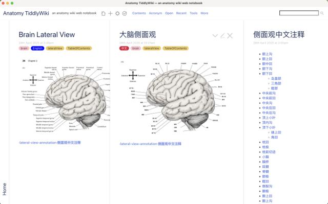
解剖学太微笔记
ImageCards - bundle - 自定义组件

ImageCards.tsx组件:
import React from 'react';
import styles from './ImageCards.module.css';

export default function ImageCards({ num, children }) {
  // 根据传入的num属性限制显示的卡片数量
  const cards = React.Children.toArray(children).slice(0, num);

  return (
    <div className={styles.container}>
      {cards.map((card, index) => (
        <div key={index} className={styles.cardWrapper}>
          {card}
        </div>
      ))}
    </div>
  );
}

function Card({ arrow, title, href, children }) {
  return (
    <a
      href={href}
      className={styles.card}
      target="_blank"
      rel="noopener noreferrer"
    >
      <div className={styles.imageContainer}>
        {children}
      </div>
      <div className={styles.content}>
        <div className={styles.titleContainer}>
          <h3 className={styles.title}>{title}</h3>
          {arrow && <span className={styles.arrow}>→</span>}
        </div>
      </div>
    </a>
  );
}

ImageCards.Card = Card;
ImageCards.module.css
.container {
  display: grid;
  gap: 1rem;
  grid-template-columns: repeat(auto-fit, minmax(300px, 1fr));
  margin: 2rem 0;
}

.cardWrapper {
  border-radius: 8px;
  overflow: hidden;
  box-shadow: 0 2px 4px rgba(0, 0, 0, 0.1);
  transition: transform 0.2s ease;
}

.cardWrapper:hover {
  transform: translateY(-4px);
}

.card {
  display: block;
  text-decoration: none;
  color: inherit;
}

.imageContainer img {
  width: 100%;
  height: auto;
  display: block;
}

.content {
  padding: 1rem;
  background: var(--background-color);
  color: var(--text-color, inherit);
}

.titleContainer {
  display: flex;
  align-items: center;
  justify-content: space-between;
  width: 100%;
}

.title {
  margin: 0;
  font-size: 1.1rem;
  overflow: hidden;
  text-overflow: ellipsis;
  white-space: nowrap;
}

.arrow {
  font-size: 1.5rem;
  margin-left: 0.1rem;
  flex-shrink: 0;
  transition: transform 0.2s ease, color 0.2s ease;
}

.arrow:hover {
  transform: translateX(4px);
  color: #0070f3;
}

/* 暗色模式样式 */
@media (prefers-color-scheme: dark) {
  .content {
    --background-color: #1a1a1a;
    --text-color: #ffffff;
  }

  .arrow:hover {
    color: #1e90ff;
  }
}
自定义组件使用方法:
// 在mdx文件中引入
import ImageCards from 'components/ImageCards'
// ...other codes
<ImageCards num={2}>
<ImageCards.Card
arrow
title="Documentation theme"
href="https://keep-thinking.netlify.app"
>
<></>
</ImageCards.Card>
<ImageCards.Card
arrow
title="Blog theme"
href="https://keep-thinking.netlify.app"
>
<></>
</ImageCards.Card>
</ImageCards>Image Magnifier - 自定义组件
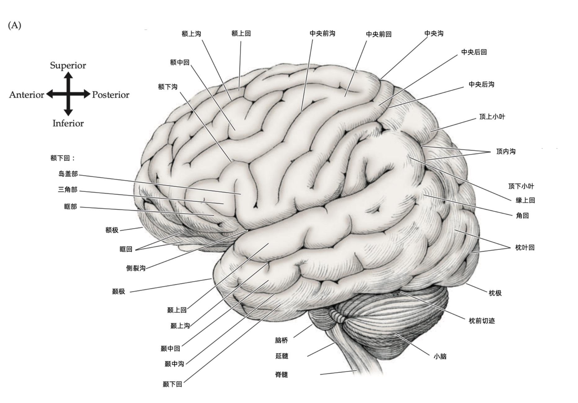
ImageMagnifier.tsx组件:
'use client'
import React, { useState, useRef } from 'react';
import styles from './ImageMagnifier.module.css';

interface ImageMagnifierProps {
  src: string;
  width?: string;
  height?: string;
  zoomLevel?: number;
}

const ImageMagnifier: React.FC<ImageMagnifierProps> = ({
  src,
  width = '100%',
  height = 'auto',
  zoomLevel = 2,
}) => {
  const [showMagnifier, setShowMagnifier] = useState(false);
  const [position, setPosition] = useState({ x: 0, y: 0 });
  const containerRef = useRef<HTMLDivElement>(null);

  const handleMouseMove = (e: React.MouseEvent<HTMLDivElement>) => {
    if (!containerRef.current) return;

    const container = containerRef.current;
    const { left, top, width: containerWidth, height: containerHeight } = container.getBoundingClientRect();
    const x = e.clientX - left;
    const y = e.clientY - top;

    // 确保位置在容器范围内
    const boundedX = Math.max(0, Math.min(x, containerWidth));
    const boundedY = Math.max(0, Math.min(y, containerHeight));

    setPosition({ x: boundedX, y: boundedY });
  };

  return (
    <div
      ref={containerRef}
      className={styles.container}
      style={{ width, height }}
      onMouseEnter={() => setShowMagnifier(true)}
      onMouseLeave={() => setShowMagnifier(false)}
      onMouseMove={handleMouseMove}
    >
      <img src={src} alt="magnified" className={styles.image} />
      {showMagnifier && (
        <div
          className={styles.magnifier}
          style={{
            backgroundImage: `url(${src})`,
            backgroundPosition: `${(position.x / containerRef.current?.clientWidth! * 100)}% ${(position.y / containerRef.current?.clientHeight! * 100)}%`,
            backgroundSize: `${zoomLevel * 100}%`,
            left: position.x,
            top: position.y,
          }}
        />
      )}
    </div>
  );
};

export default ImageMagnifier;
ImageMagnifier.module.css:
.container {
  position: relative;
  overflow: hidden;
}

.image {
  width: 100%;
  height: auto;
  display: block;
}

.magnifier {
  position: absolute;
  width: 150px;
  height: 150px;
  border: 2px solid #fff;
  border-radius: 50%;
  box-shadow: 0 0 10px rgba(0, 0, 0, 0.3);
  pointer-events: none;
  transform: translate(-50%, -50%);
  z-index: 1;
}
自定义组件使用方法:
// 在mdx文件中引入
import ImageMagnifier from 'components/ImageMagnifier'
// ...other codes
<ImageMagnifier
  src="/images/脑侧面01-中文标注.jpg"
  width="100%"
  zoomLevel={10}
/>